Dashboard Overview
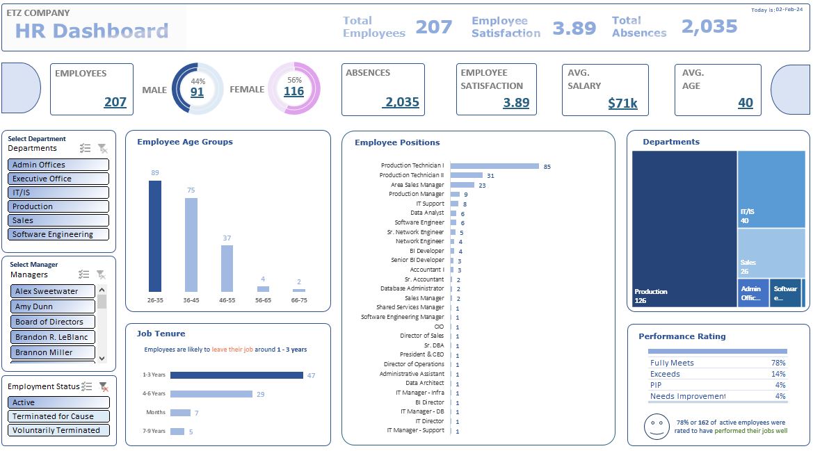
Here is the overview of the Excel Report. May opt to view the full interactive report by downloading this file.
Dashboards are a great story-telling technique. As presenting large sets of data plays crucial role in many decision-making process, it is important for dashboards to showcase key metrics that helps in understanding information.
Different types of Excel charts can help visualize data. For example, PIVOT charts with slicers are useful in creating a dynamic dashboards to easily compare and present key metrics. By just looking at the charts, audience can even form insights from the data.The following section will provide a runthrough on what happened to the operation and how it affects the company.
Perform analysis and visualize the given HR Department data.
Get to know the dataset, perform data cleaning, formulate and list key metric indicators. Utilize PIVOT tables with slicers and Excel formulas to create a professional dashboard.
Dashboard with emphasis on the key performance indicators. With understandable figures, more informed decisions can be made.
Here is the overview of the Excel Report. May opt to view the full interactive report by downloading this file.
Distributed By Themewagon